![]() Don’t let this scare you. It doesn’t mean that everything must fit a cookie cutter mold. Think about when you walk into a grocery store and you look at an entire brand’s line. You can tell they are all made by the same company, but each product itself looks different.
Don’t let this scare you. It doesn’t mean that everything must fit a cookie cutter mold. Think about when you walk into a grocery store and you look at an entire brand’s line. You can tell they are all made by the same company, but each product itself looks different.
Remember that every social platform is designed to do something different because they each serve one sole purpose. Have those purposes in mind when designing and creating content for your social sites. Also think about how much time people spend on each site. People quickly scroll through Twitter to read tweets and you can be a lot more creative with your Twitter background than you can on Facebook.
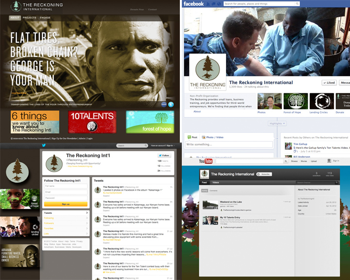
This is the same approach you should take when on social media sites. Yes, every home page should be different (mostly because they load differently depending on the site), but there should be a unified look. When someone comes across your Twitter page then goes to your Facebook, Youtube, LinkedIn and blog page they should be able to tell it is the same company.
Every site should include the following:
•Contact Information
•Company Logo
•Company Color Scheme
Other than the things listed above, you can change it as much as you would like! It helps to look at all of your pages next to each other to determine if it looks and feels right. Also while determining a design, keep in mind different browser sizes and how it will load on mobile devices. Changing your social media layouts every so often is a good habit to get into. Here are some examples of what we have done for client’s on social media platforms to create a unified yet different look across all sites.

