They say that copying is the highest form of flattery. If that is so, then Facebook and Google+ should be very flattered by LinkedIn’s new look. The new layout looks like a mix between the two.
Like on Facebook ,the more relevant updates are loaded at the top of the page with an added comment stream in a different color blue. It also includes a stream that shows which people and how many commented and like a post.
It resembles Google+ in a way that it is less cluttered than Facebook. The new header on LinkedIn is displayed in black with headers like “home”,”profile” and “contacts”. I believe that Youtube also has a similar black band at the top of their page containing the navigation.
There is a richer and cleaner update stream on the new layout. The updates are a continuous stream so you no longer have to click “see more” to receive all of the updates from your network. They have also made it easier to see what your connections are talking about and to engage by liking, commenting or sharing updates.
Caroline Gaffney, a product manager at LinkedIn, stated in a blog: “This simpler and cleaner design makes it easier to navigate the page and quickly find the updates you’re looking for–whether that’s a news article your boss has recently shared or it’s to see who has just started a new job.” She also talked about how this is just the start of more exciting and new features that LinkedIn plans on releasing.
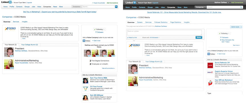
If you log into LinkedIn and don’t notice a change, that is because they are rolling out the new homepage to all members over the next few weeks. Just like with Facebook’s timeline, LinkedIn is making it a gradual change. With roughly 4.2 billion users, it doesn’t make sense why they wouldn’t all have the same display. Below are a few of the pages side by side, see if you can notice the changes.

The old home layout is on the left and the new one is on the right. Images now display in the news feed along with the different status bar.

Not much has changed on this page, other than the navigation bar.

Again, not much of a difference on this page either.
sources: Mashable, LinkedIn
